I have always hoped that Flame’s nodes and node graphs can be fully vectorized and have high-definition thumbnail mechanisms to enhance the visual experience . I have also made suggestions and hope to receive widespread support from everyone. Those who agree can
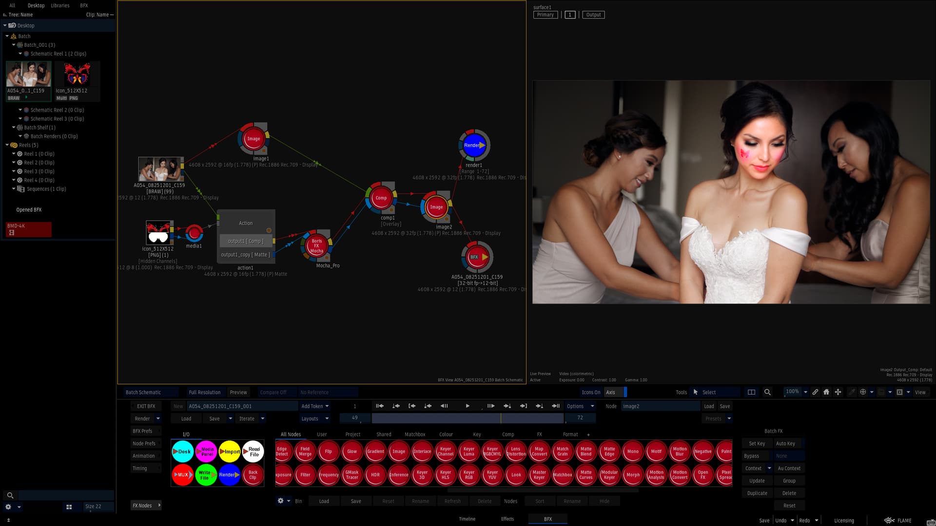
At present, I have slightly modified the default node graph background bitmap and input/output node graph style of Flame, which looks good. Let me share with you first. The Flame node diagram should not be a fixed gray tone, but can also become colorful.
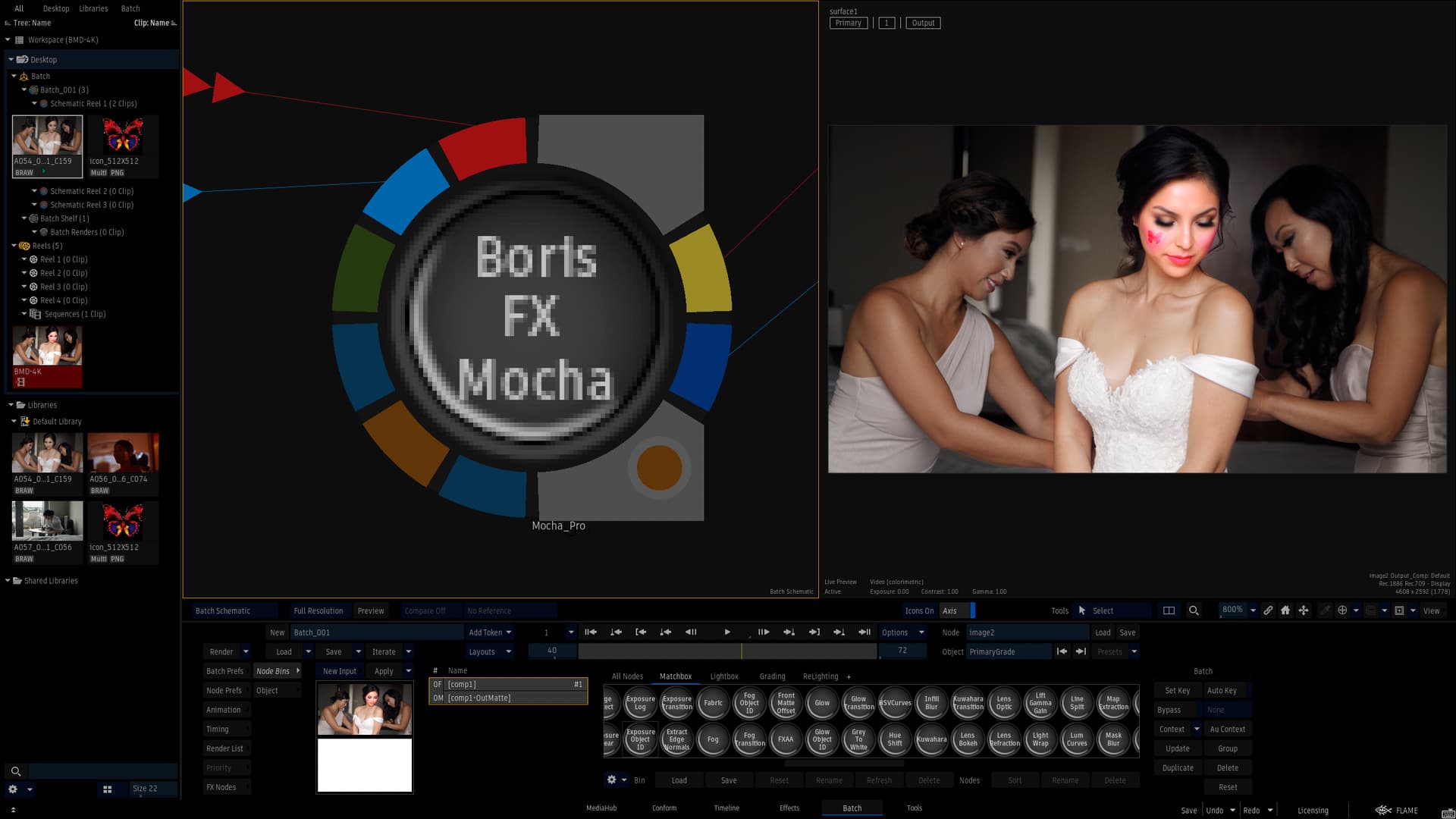
Of course, what I am most looking forward to is using vector algorithms to replace the blurry background bitmap, in order to avoid mosaic and jagged edges when the node map is enlarged.
In terms of compositing, you want to avoid looking at highly saturated icons and images and then looking back to your footage because of relative contrast. I’m always amazed when I see compasses and stuff that are neon green and screaming red and really bright violets, grey is the way when it comes to avoiding optical illusions.
I may not agree with your choice of colors but yes I do wish the nodes in batch could have predefined colors that could be adjusted as a user preference. Coloring of the name alone I don’t think is really moving the needle much.
I also agree. I like where matchboxes are now orange. It would be good to be able to customise for specific groups / types of matchboxes, like colour grade, keying, blurs etc.
Actually, my original intention was just to vectorize both the nodes and nodes schematic of Flame, because the central area of Flame nodes, including node names, is a bitmap, and the gray background bitmap at the center of the node calls several identical bitmaps. When we zoom in on the node schematic , the nodes appear mosaic and jagged, which greatly affects the visual experience.
Currently, I have only replaced two background bitmaps and modified the IO node icon style. We can replace them with any personalized PNG image as long as the size matches.
Once again, I would like to emphasize that my core goal is for the Flame development team to vectorize and high-definition nodes and node schematic , and introduce a high-definition thumbnail mechanism that can achieve high-definition display thumbnails of clips and nodes .
I completely agree with your viewpoint. High saturation nodes and node schematic can indeed affect our judgment of footage colors . The example image is just a personalized example that I can modify.
Actually, the central area of Flame nodes, including node names, is a bitmap, and the gray background bitmap at the center of the node calls several identical bitmaps. Currently, I have only replaced two background bitmaps and modified the IO node icon style. We can replace them with any personalized PNG image as long as the size matches.
This requires the Flame development team to redefine the display mechanism of nodes and node schematic. Currently, they are only calling pre made PNG bitmaps. It is definitely impossible to achieve the classification display of nodes.
Yeah I know. Someone a few years back replaced them all with different looking donuts. I tried to find the screen cap but sadly it might be lost forever. I just think this is something that should be part of the UI.
Yeah, The default colors for compasses and everything, I almost never can use. They are so super saturated and bright and harmful to the eyes when trying to do visual effects.
I’d very much like to be able to have my custom colors just come up automatically, colors of which are all muted and desaturated and not painful to look at. I’m not sure that whoever picked the colors for this, actually used it in real life.
When the node is enlarged, the mosaic and jagged edges are very obvious. If it is a vector graph, these problems will not occur. You can see that the area around the node is a vector graph, and there are no obvious jagged edges or mosaics when enlarged.
Why would I care about the mosaic and jagged edges of the node icons at that zoom level? I don’t even come close to that zoom level. I mean, instead of this, I would prefer a new particle system.
Hello ,I don’t think the two are contradictory, one about GUI and the other about functionality. The reason for enlarging the node diagram is to illustrate more clearly that vector node schematic are much better than bitmap note schematic. We often zoom in on the node schematic to see information related to the nodes, rather than the nodes themselves, but at the same time, what we see is mosaic and jagged edges. Since there is a lossless algorithm like vector graphics that is suitable for nodes, why not use it? I just want Flame’s UI to become more beautiful and refined.
It’s a matter of resource allocation. Although a vectorized UI would look (marginally) better, I would prefer to see that resource allocated to developing functionality into the software instead of UI vectorization.